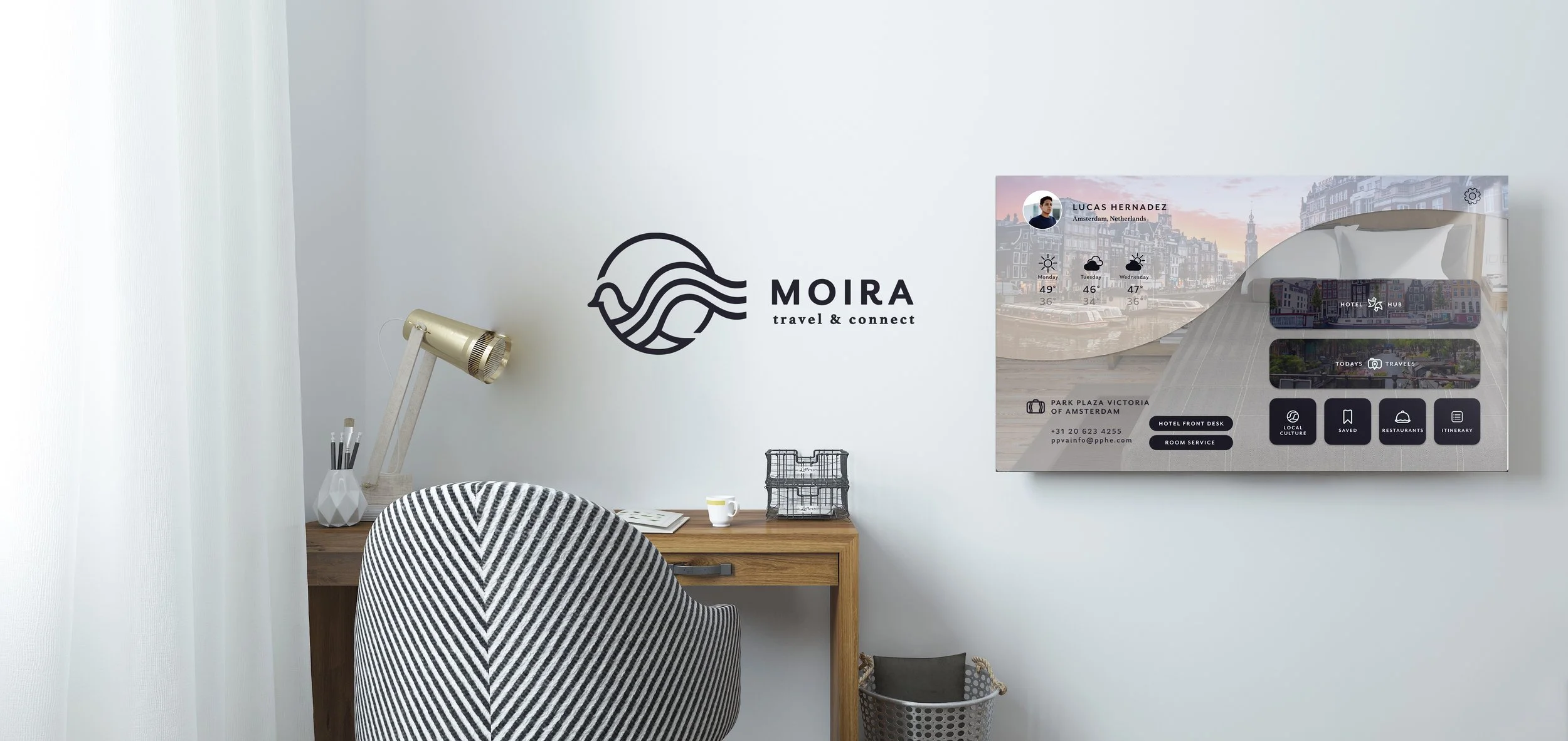
moira
Branding • Typography • UI/UX • Web • Interface • App
Institution: Tyler School of Art & Architecture, Temple University
Art Direction: Abby Guido
Fall 2021
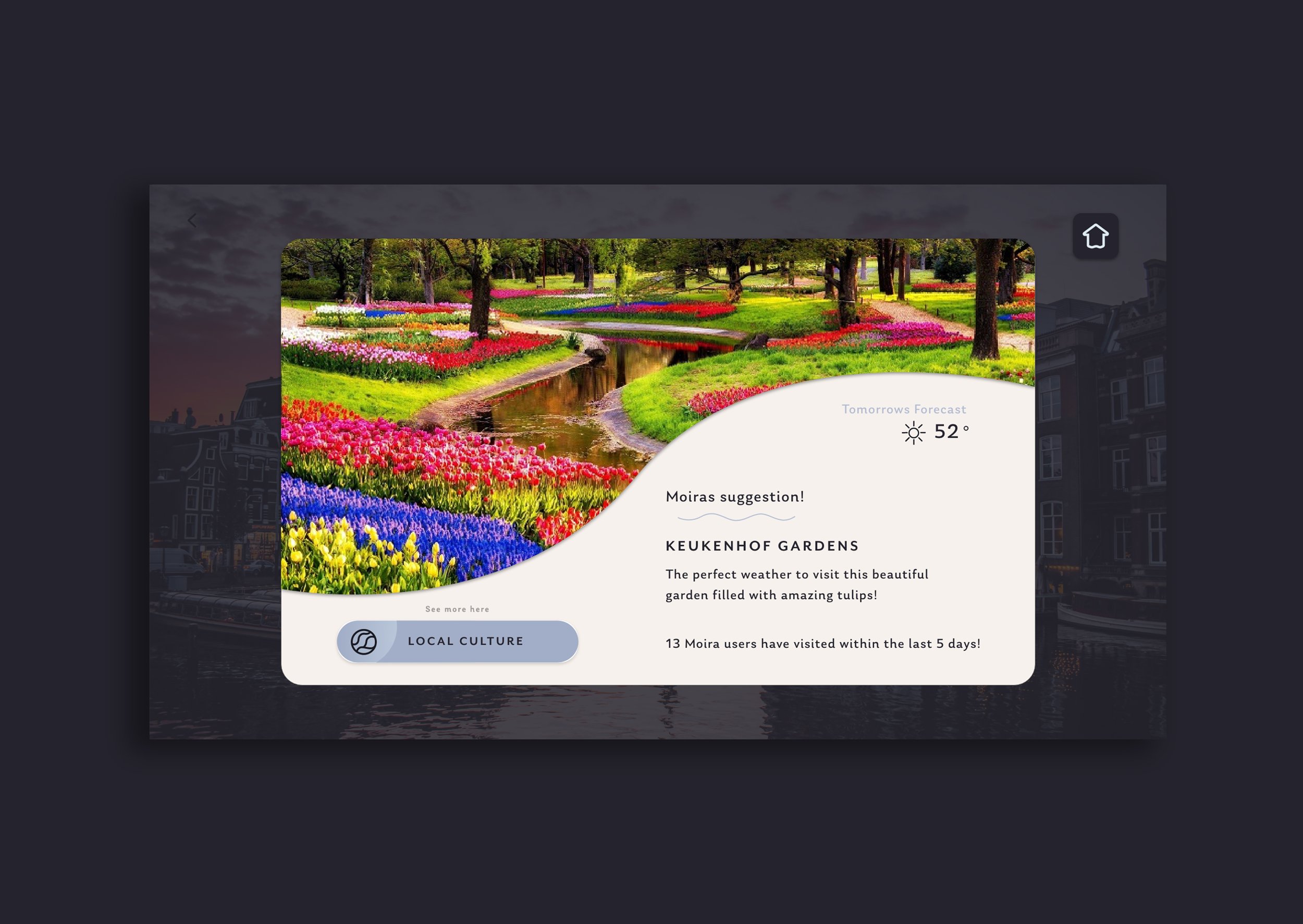
This extensive branding project was created with a classmate of mine tackling the issue of traveling alone with no knowledge of the country you are in. We created a smart mirror interface with an accompanying bluetooth remote app that is in hotels recommending points of interest, locations nearby, and restaurants for the specific location you’re staying. It also includes a social aspect that allows the residents to connect with other travelers in the hotel.
behind the name and branding
Moira means destiny which can be interpreted in many different ways, but with this project we wanted to capture the sophistication brand in a simple, but meaningful way. For the style of our logo, we took a lot of inspiration from sophisticated hotel logos as well postal stamps. We wanted to steer away from traditional airplanes motifs for traveling thus deciding to go with a bird as our main visual. It represents freedom, flight and connectivity, all of which this brand represents!
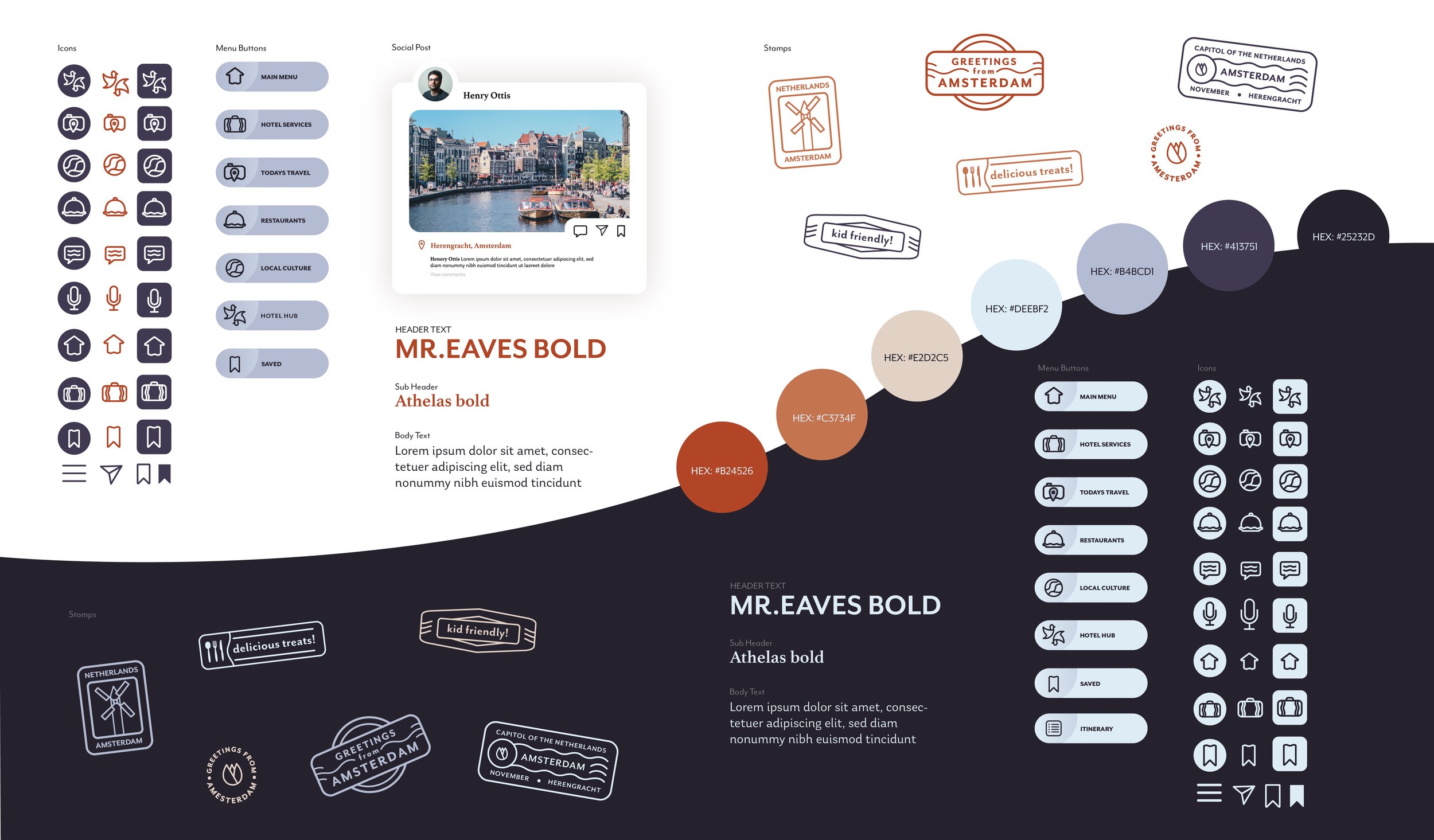
Final style guide for Moira
process and sketching
Our logo initially went through many phases because we wanted to capture all of the brands concept. I was in charge of the logo and developing the brands style thus experimented with many different bird poses and placements. I wanted to create a memorable mark that resembles postage stamp as well as embodying the sophisticated look of travelling.

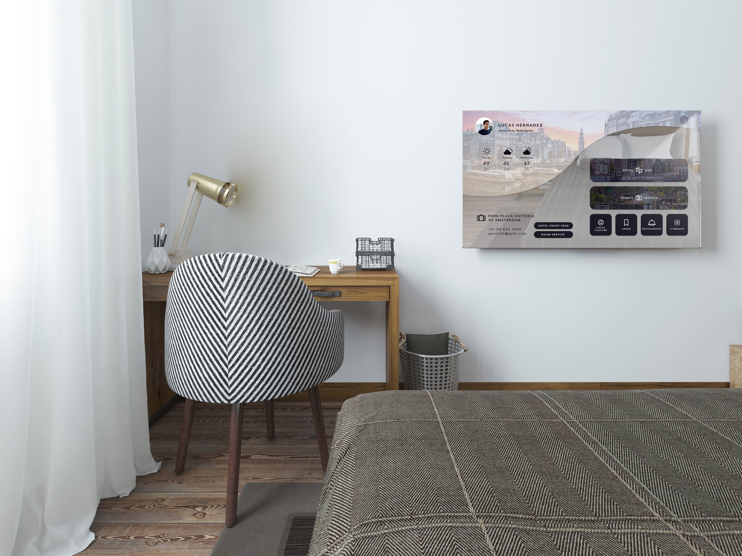
day and night
We implemented a day mode and night mode design for users to see the screens clearly based on lighting. Based on our surveys, most travelers use the hotel during the night time so our main priority is creating screens for the night mode. We included slideshows, gallery views, and sleep mode for users to see the places they visited that day and gave the option of posting onto the hotel hub for others to see!


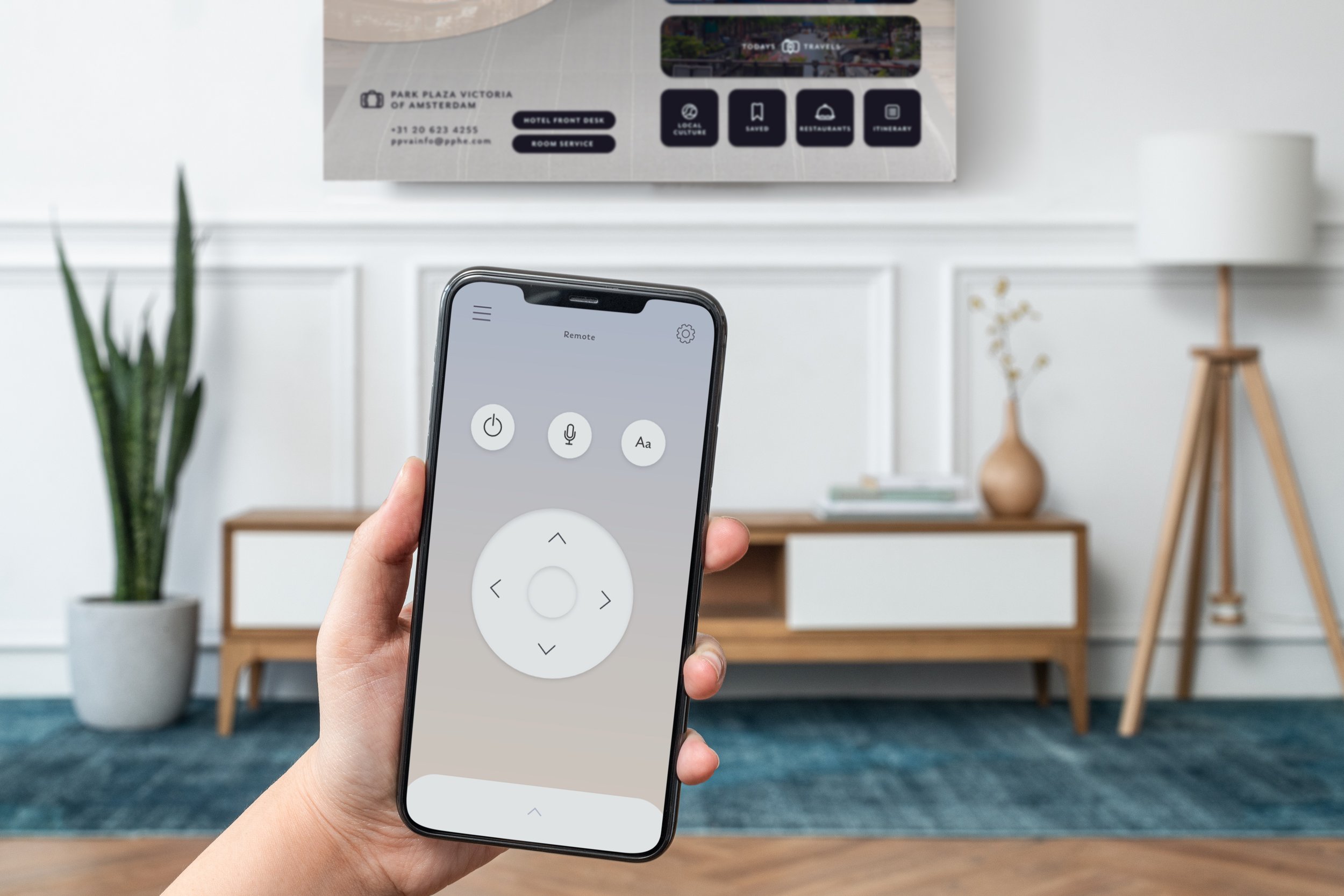
the app and functionality
With the bluetooth app we wanted to create an even easier user journey by making the smart mirror screens responsive so they could use it on the go. In addition our focal point is the use of our bluetooth remote that connects to the smart mirror, so our users are not aimlessly scrolling on their mirrors after a long day of exploring.


other deliverables
Through the interface we provided an option for the users to create postcards using their own photos they took on their journeys. They can send it to family and friends digitally through email and text messages as well as physically printed out. Before they leave the hotel, they will receive their printed postcard as well as complimentary luggage tags.


Conclusion
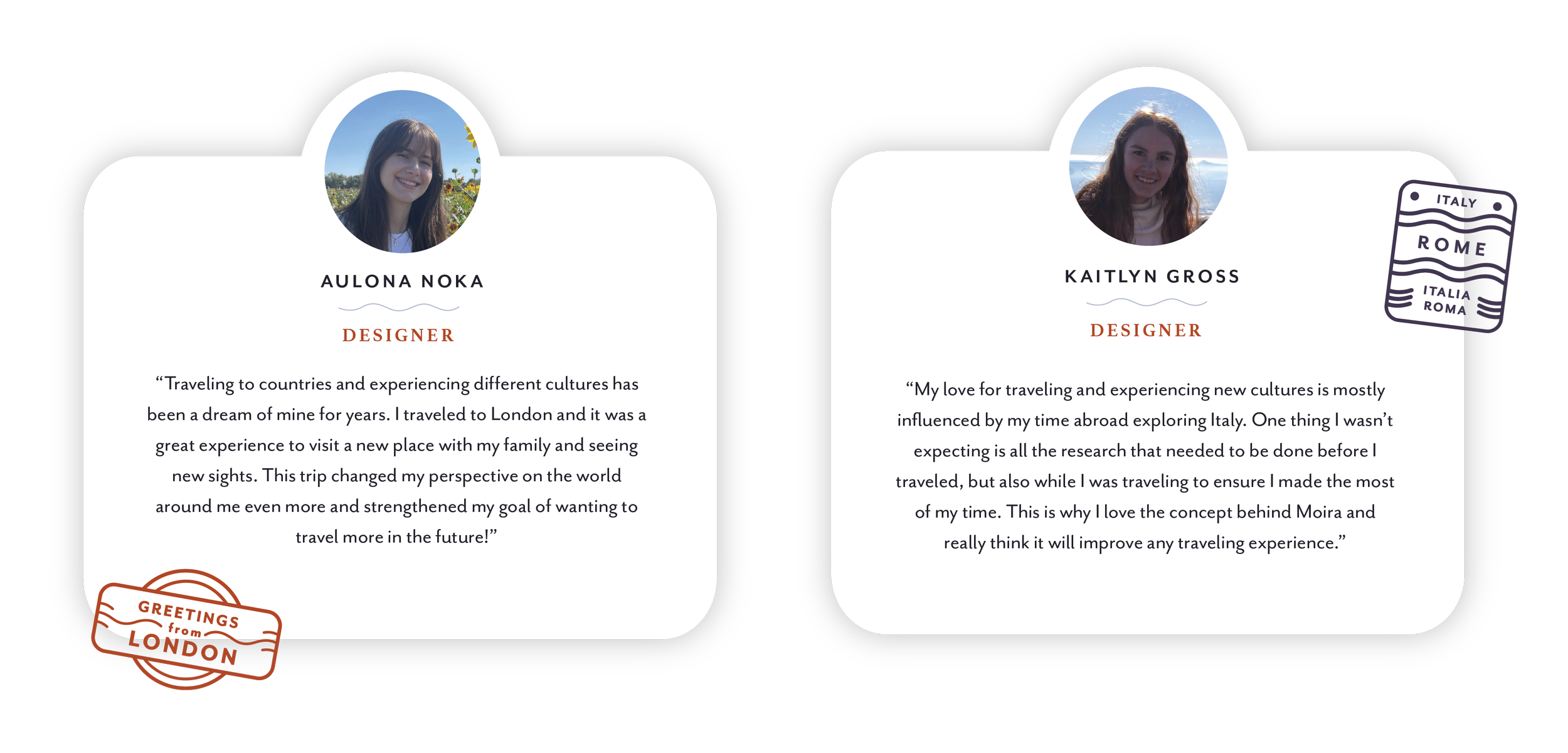
Working together was very helpful as we were both able to show our design strengths, mine being branding. I made sure to progress the logo, colors, icons, stamp designs and more. We also conducted insightful research and surveys to hone on the problem and how we solved it through our interface.
We ran into many practical challenges like making sure the app functions with the smart mirror and the type being big enough on such a large screen. However, it was a fun process to do a project alongside a classmate with similar interest in the traveling industry!